Maternity Header Redesign
Company
Maven Clinic
Timeline
Q4 2025 – Q2 2026
Impact
Phase 1: 25% lift in retention · Phase 2: 23% additional lift
Executive Summary
Maven's maternity homepage relied on a passive fruit-size metaphor that gave members little reason to return week over week, at a time when engagement was critical to catching members who needed clinical support. I led product design and research on a redesigned weekly experience, grounded in clinical rigor, that gave members real reasons to come back. The result: a 25% lift in retention, plus a further 23% lift from an added weekly story format.
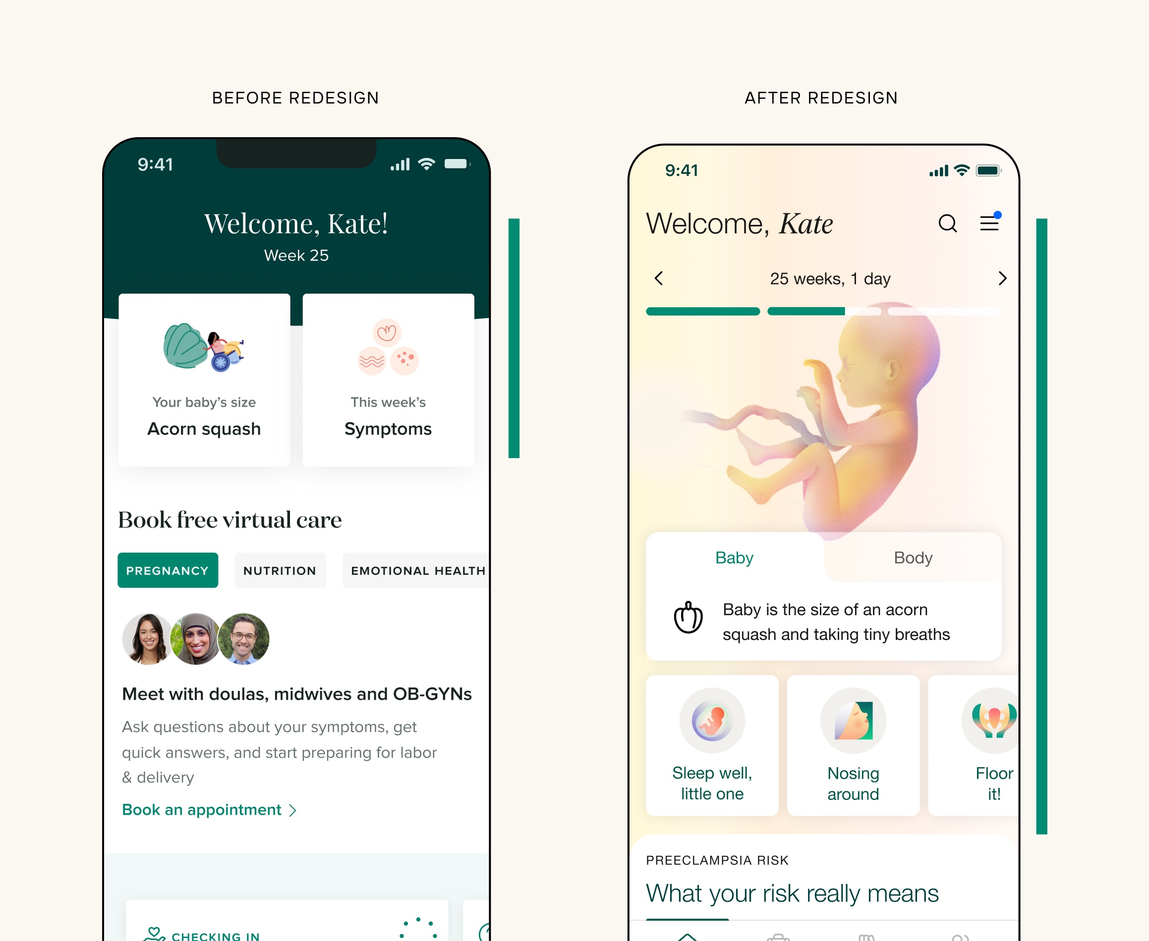
The before and after of this project
Problem
Maven's maternity product is its flagship offering, and it hadn't been seeing good engagement for a long time. The maternity homepage's prior hero experience used a fruit-based size metaphor — "your baby is the size of an apple" — that gave members a weekly size reference for their baby, but no other reason to engage week over week. It also did little to differentiate Maven from other pregnancy products, and Maven's actual market distinction, being a virtual clinic, wasn't showing up in the experience at all.
This mattered beyond the competitive gap: Maven's core business objectives centered on driving clinical outcomes, but engagement was the gate. If members weren't coming back, there were fewer chances to catch them and help when it mattered — so better engagement meant a real shot at better outcomes, and this project carried significant weight because of it.
Opportunity
To replace a passive, one-off metaphor with a more holistic weekly ritual that members would actively come back for: richer baby and body content, tied to a clearer sense of what's actually happening this week.
Project Overview
I led product design, working closely with a product manager, an engineering team, content writers, a creative director, and a freelance illustrator. The project ran about six months, starting with several weeks of user interviews and concept testing, then moving into numerous rounds of design, testing, and iteration.
Phase 1
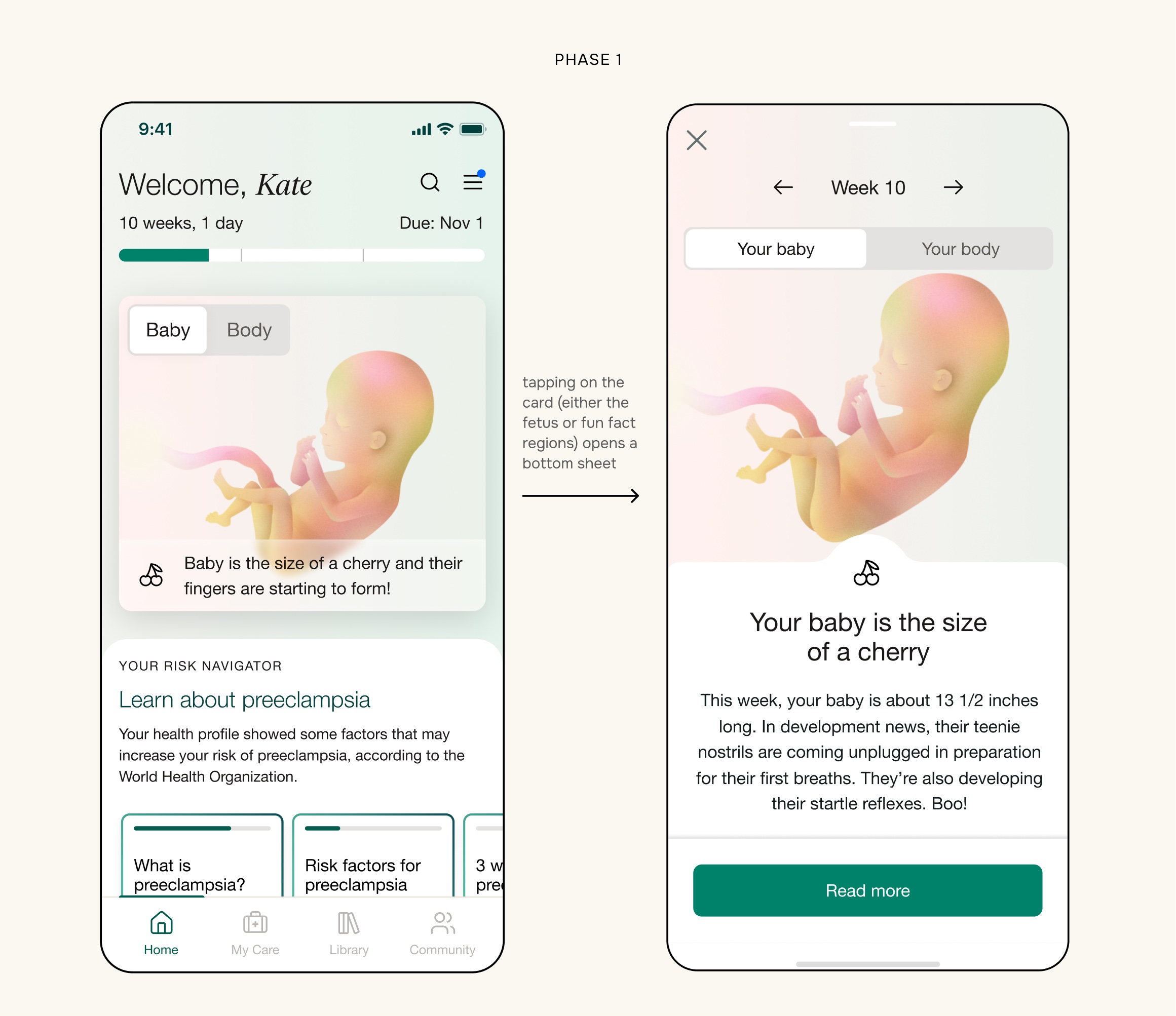
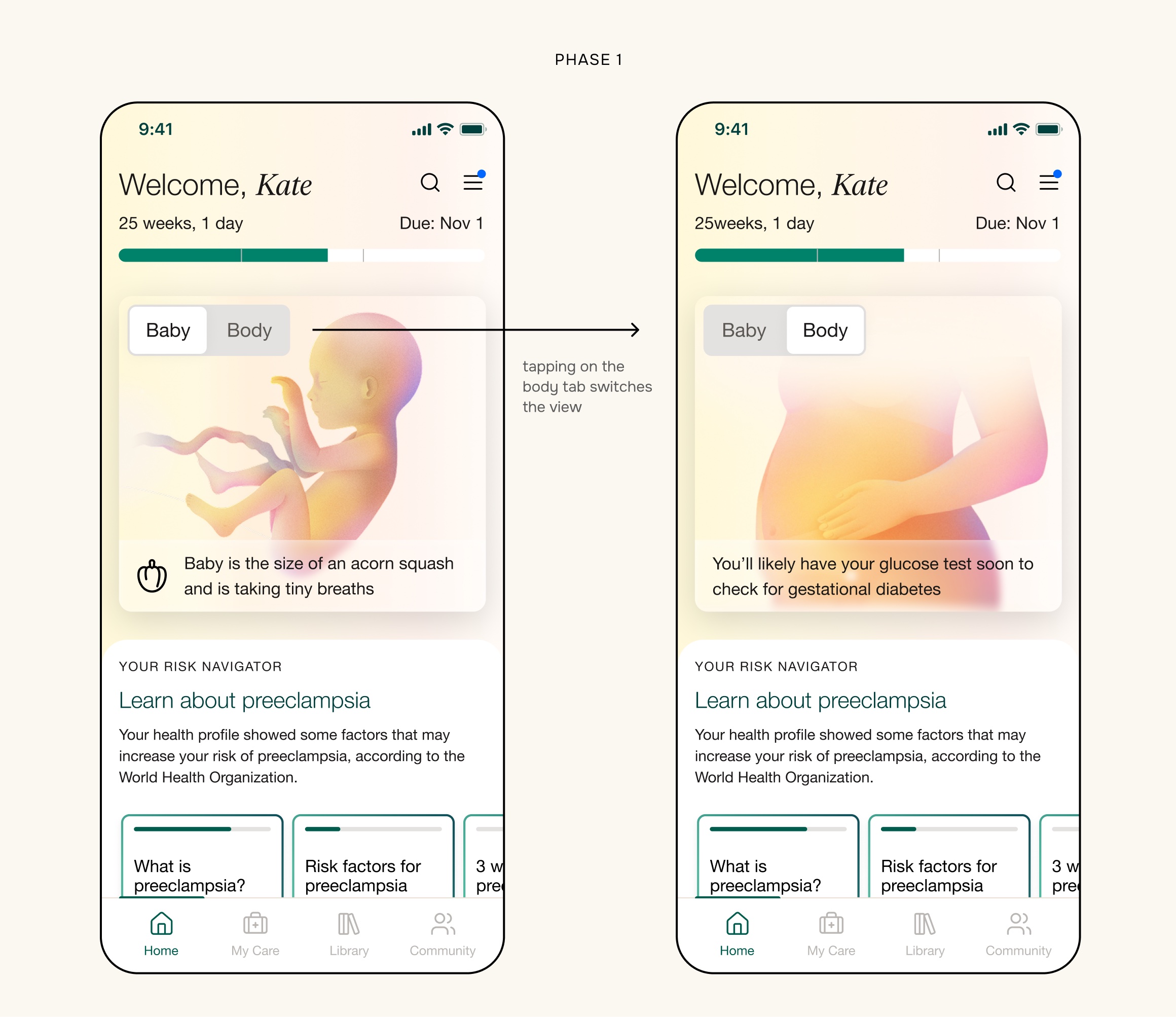
I started this project by running foundational research that shaped the concept. Once we locked down a direction, I redesigned the “front door” of the experience as a card that included the baby/body imagery, toggle, and fun facts. When the card was clicked, a bottom sheet pulled up to reveal additional copy plus a link to a long-form article on the week’s development. I didn’t design the bottom sheet as part of this work. The plan was to replace the long-form article with short-form story content in phase 2, so we left it as is for phase 1.
Phase 2
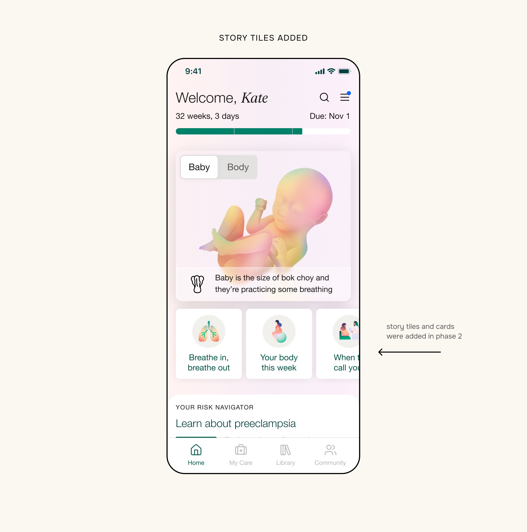
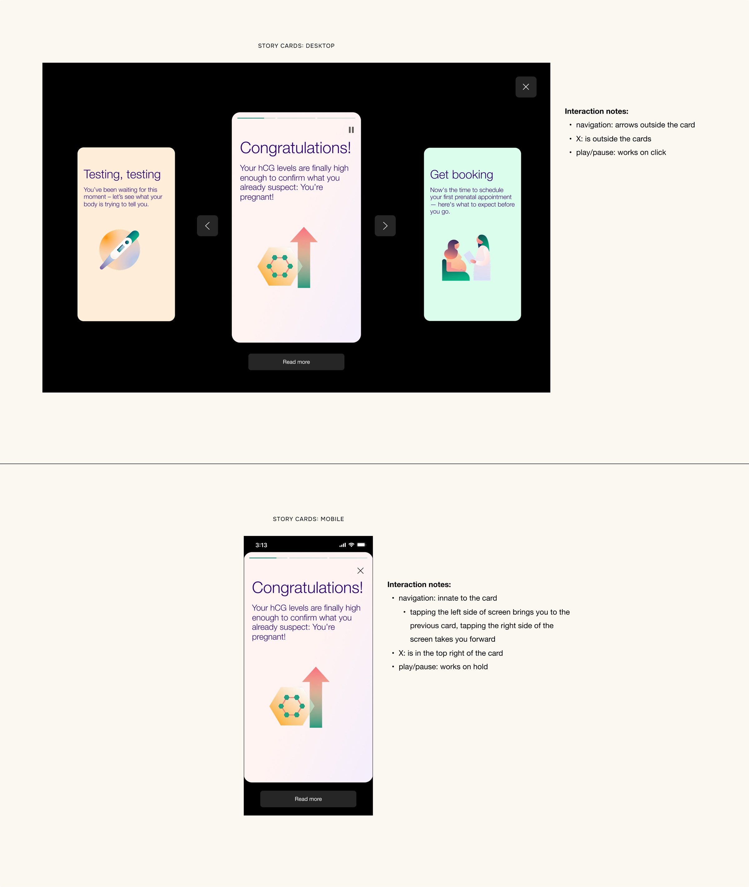
Once Phase 1 landed, Phase 2 scaled that same philosophy, engaging and consumer-friendly but rooted in clinical rigor, into a fuller weekly stories experience with milestone-related content that gave members even more reason to return. Each week had four to five stories, each made up of three to five cards for the member to read through.
Phase 3
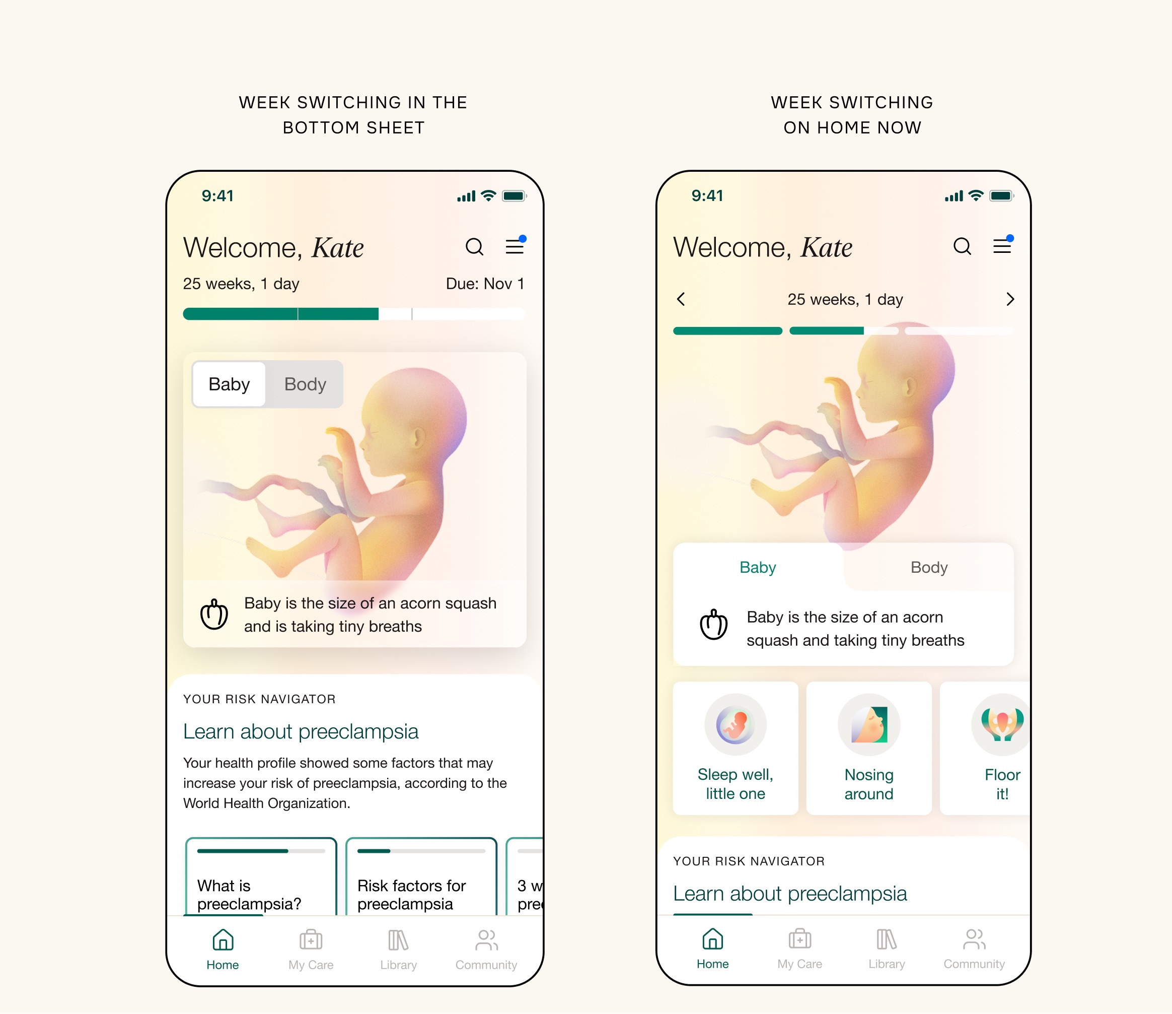
Once we added the story cards, we no longer needed the long-form link and bottom sheet from phase 1. So, in pursuit of simplicity, we got rid of the entire bottom sheet experience and moved the week-switching ability directly to the homepage.
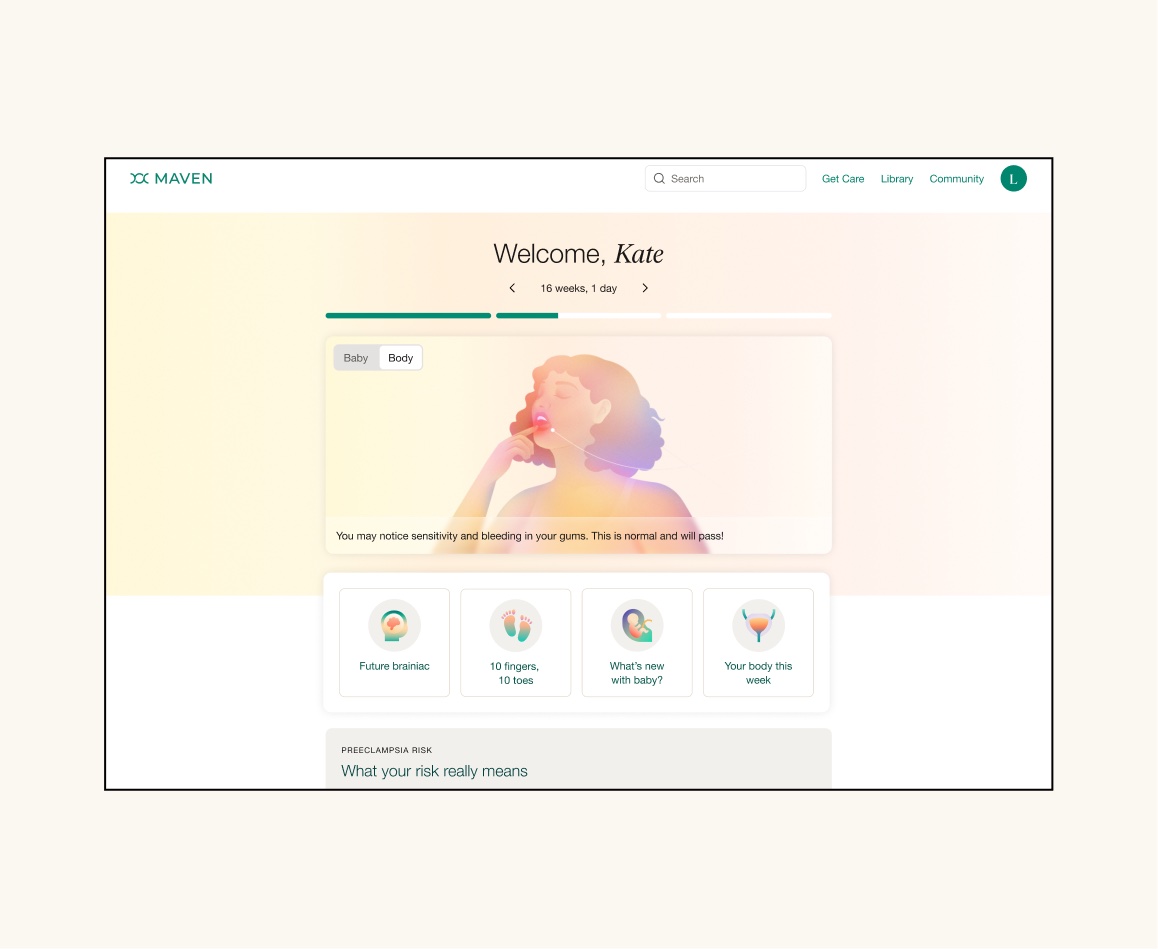
A peek at the desktop design
Assets & Production
This project needed a ton of visual assets to come to life: iconography, pictograms, and main illustrations. We commissioned out the main baby and body illustrations as well as the fruit metaphor line icons, and I designed all of the multicolored story card and fruit pictograms myself, using Recraft.
The story cards were their own production challenge. We worked systematically with the content team to write content across pregnancy-related topics, covering both baby and body, across all 40 weeks, split into a series of decks per week. I found common themes across all of it and created 80 pictograms to be recycled strategically across the full set of 700+ cards. It was a huge lift, but a genuinely fruitful one (no pun intended!).
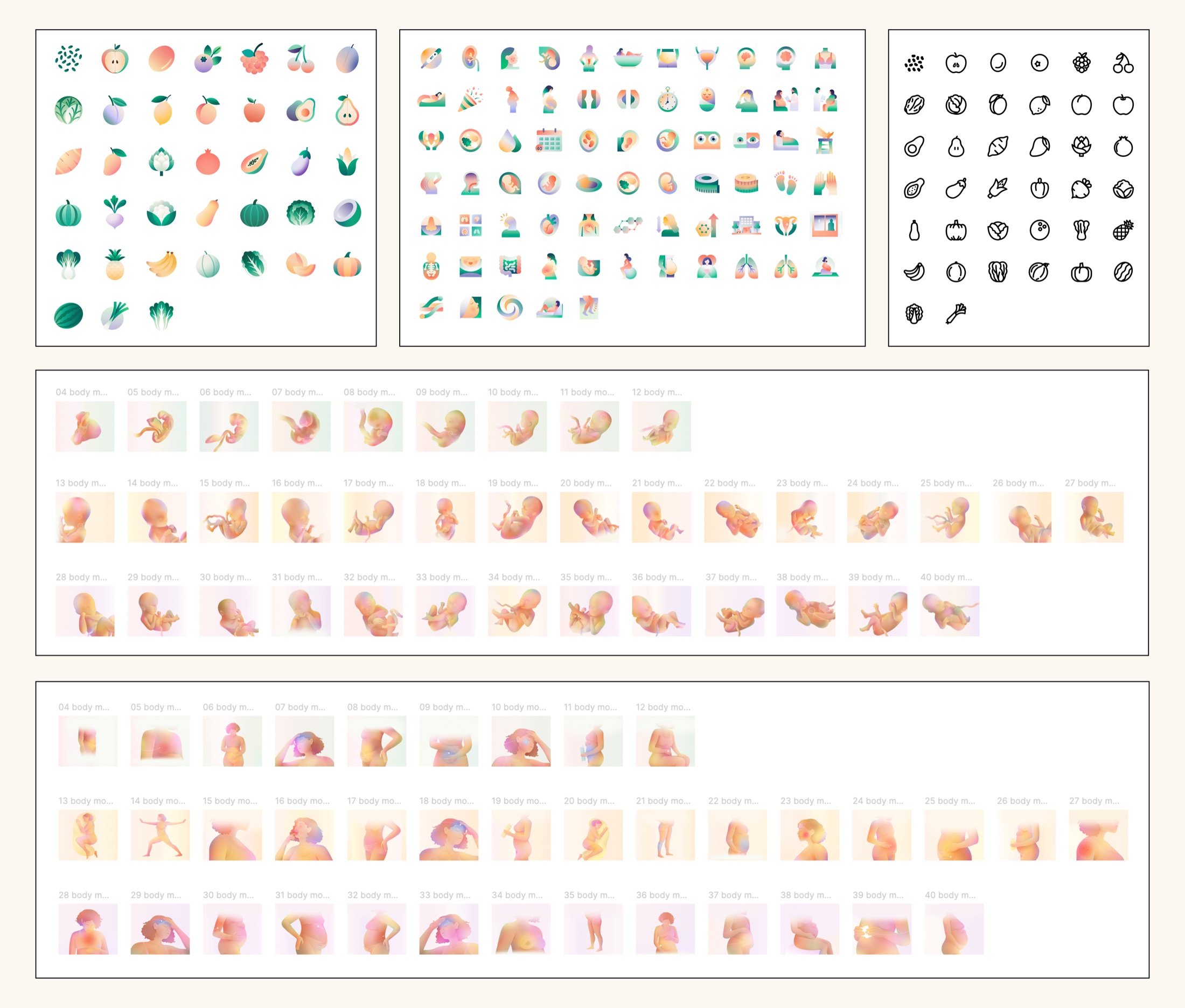
The visual assets that made this project come to life: fruit and general maternity pictograms made in Recraft, fruit metaphor line icons, courtesy of Superside, and baby and body illustrations, courtesy of Laura Alejo
Constraints
The baby/body image container size was a constant negotiation — everything vital above the fold on the homepage had to stay visible, so we iterated repeatedly to deliver a better experience without hiding anything important. That was made harder by the illustrations themselves: they were produced once, early in the project, at a single size and crop, so every later change to the container meant re-amending art that wasn't built to flex. Lesson learned – always keep art deliverables as broad and flexible as possible for unforeseen future iterations!
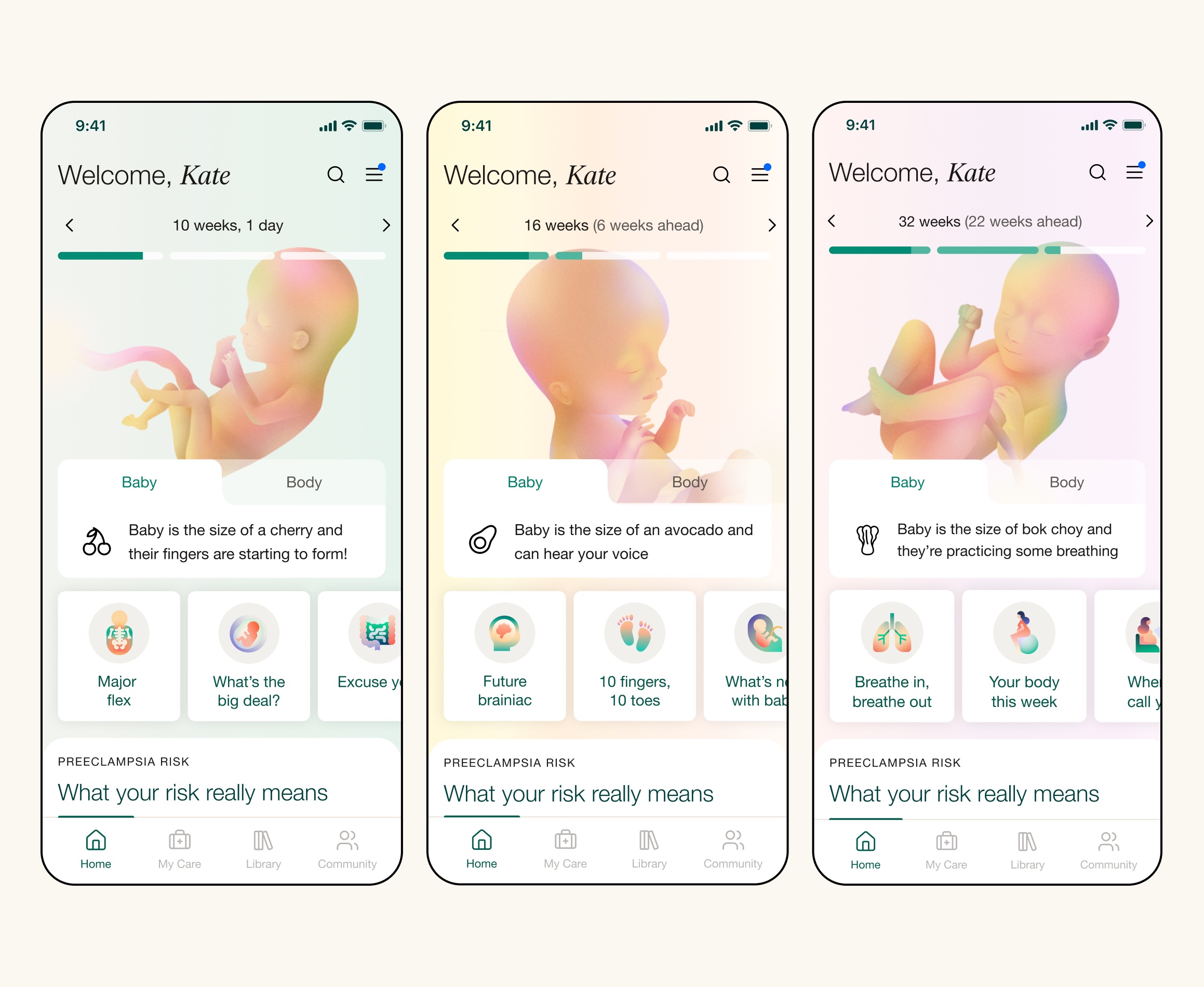
A look at how the visual experience differs depending on trimester
Impact
Over the course of the project, the redesigned header drove a 25% relative lift in retention among all pregnancy members. The weekly story format (Phase 2) added a further 23% increase in retention on top of that baseline lift. A big success!
Prototype
Here's a video walkthrough of an interactive prototype I built in Cursor, accurately depicting the maternity weekly experience with the dynamic imagery and content intact. I shared this tool with the full team as an aid for understanding what each week actually looked like in the experience, since this was a question constantly being asked by numerous teams at Maven.